simple shui | color goals: r-o-y-g-b-i-v
an easy way to experiment with feng shui’s five elements and unleash their supportive energies is with color. whether at home or somewhere in the daily details of life, an infusion of color paired with familiarity of each hue’s properties can be a reassuring experience. should you crave uncomplicated balance or desire accentuating a bold intention or two, here are some basic guideposts to get started:
water knows how to traverse obstacles, relying on its mutable powers. black and inky colors (think: aubergine, hunter green, navy blue, charcoal) express this shape-shifting element. its color spectrum can influence us to make decisions and release what no longer serves us – a suitable reminder to go with the flow instead of fatiguing over non-essential details. these colors are also efficient movers and shakers in our professional endeavors. try a pine-colored throw or a black gratitude journal.
wood encourages us to pursue new ideas while remaining flexible. greens and blues – the colors associated with wood – summon fresh starts. green is synonymous with life’s riches and new beginnings, while blue soothes the soul and dissolves tension. much like a tree growing both below (roots) and above (branches) ground, wood energy is symbolic of our own well-being and access to new growth + opportunities. try a green doormat or a blue planter pot.

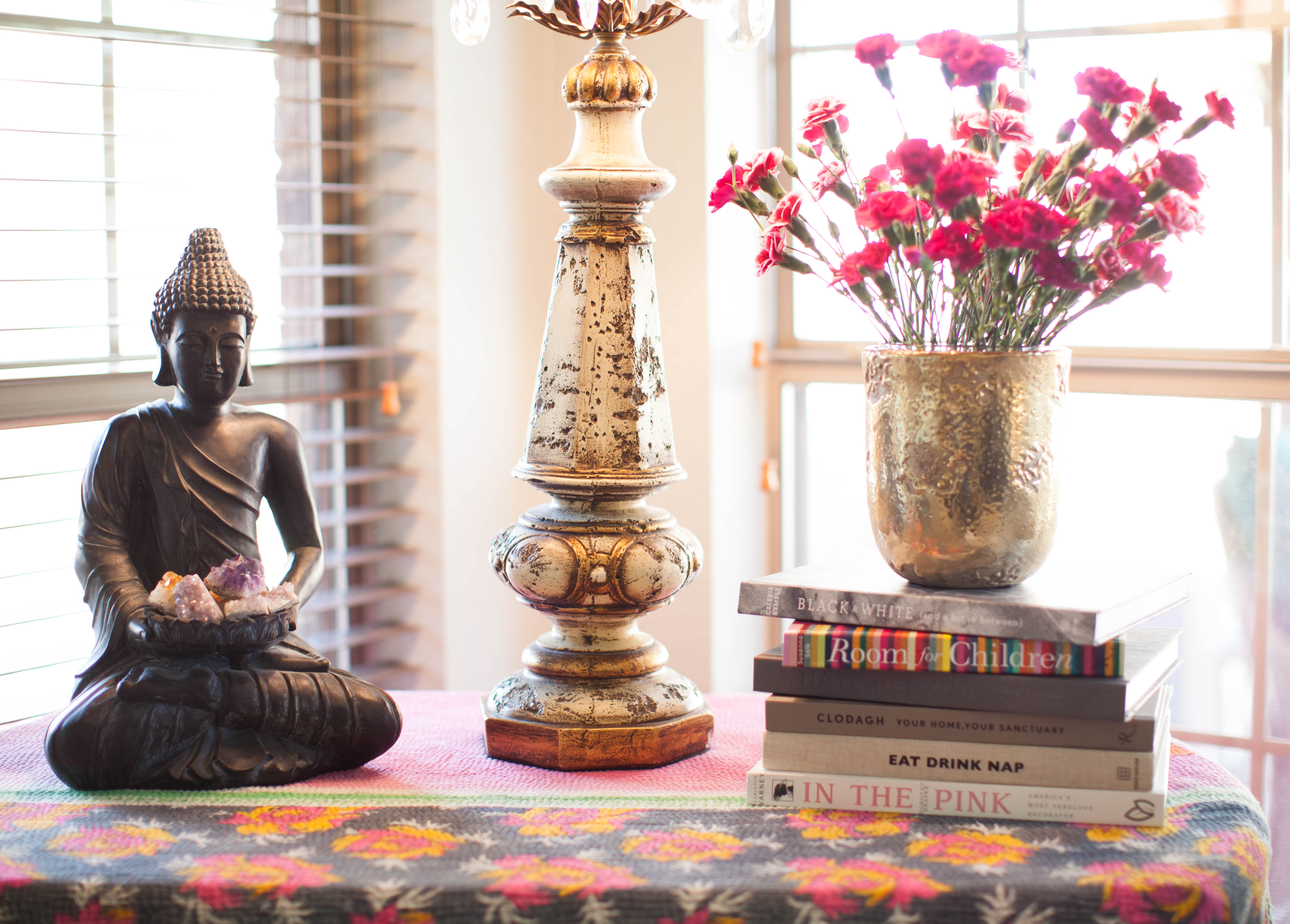
fire awakens life force and inspires our better motivations. the color red – and its wheelhouse of oranges, pinks, magenta, and maroon – represents fire. and just like fire, this palette captivates our attention and compels radiant confidence. so, if it’s time to rattle your cage or make a rapid fire change, red sparks clarity and action. one word of caution about fiery colors: they are stimulants – if overused, they will feed impulsivity and impatience. try a bowl filled with oranges or a front door wreath with red flora.
earth is grounding and comforting, reminding us how incredibly tremendous we are meant to be. earth suggests herself in the various tones of brown, yellow, and muted neutrals. this color scheme has stabilizing qualities and slows energy down. when we want to develop mindfulness – staying both focused and conversational – earth colors are the cord that root us in place. try gold curtain panels or a set of yellowware mixing bowls.
metal invites us to appreciate our mind fully, pulling together the dynamic energies of our imaginative spirit and deep intelligence. with a few brush strokes of white or light pastels, this palette promotes clear, concise communication and refuels our creative reservoir. try a white headboard or a pastel abstract print.
start with a small space, like a set of bookshelves or an entryway, and observe the elemental colors. if you come across an area that has all five, notice how the space feels. where elements are missing, mix a few bolds with the neutrals. add more greenery. or play with a pale palette. when all five elements bask in each other’s company, they pool harmonious energy. and you become its lucky recipient. xo


