simple shui x aggie armstrong
art is all about inspiration and creative energy, which makes it a very powerful tool to shift and enhance the energy in your home. the subject matter, colors, size, shape, and placement of artwork can all impact the Feng Shui of your home.
making art is an expression of the artist’s energy, so it goes without saying that the art itself is a portal of energy. how? as simple as the color element of the work of art, which can be considered the most exciting part of a painting. color can affect or create moods, it gives off vibrancy in a dead space, it sets off serenity where calm is needed; it can also bring more of natural principles when there seems to be a lack of it. color can also create spatial and perspective illusions.
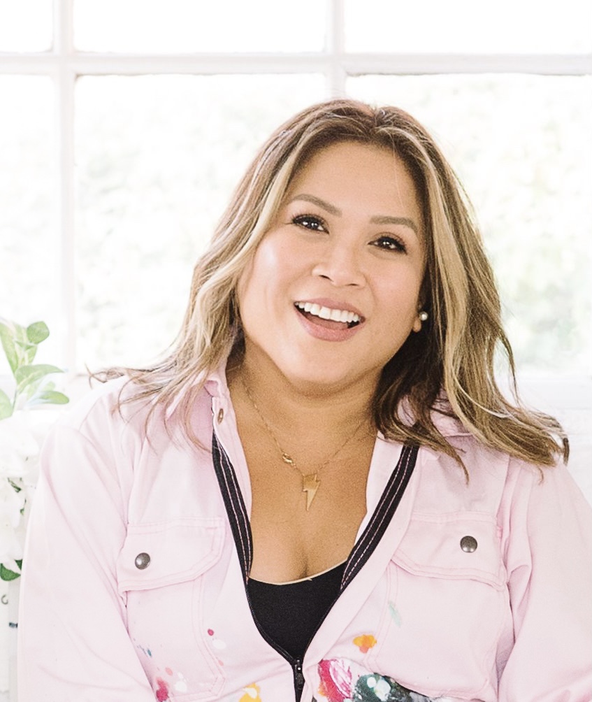
i’ve recently collaborated with Aggie Armstrong, a Filipino-Canadian multidisciplinary artist who works primarily with watercolors and acrylics. she merges pigment and fibre arts (embroidery) together.
a quick back story on our powerhouse:
Aggie graduated from the Fine Arts Program at Fanshawe College and received her Bachelor of Arts degree with a minor in Art History at Western University (previously University of Western Ontario) and photography certification from New York Institute of Photography.
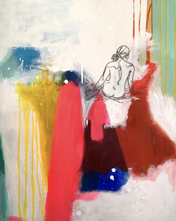
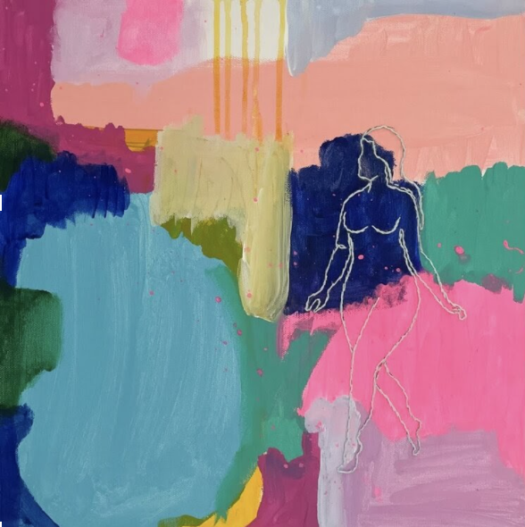
Aggie is influenced by post impressionism and neo-expressionism which she revisits in her work through the traditional wet-on wet watercolor techniques with high flow acrylics. she looks to these past art movements and experiments with style mash-ups through color and distorted subject matter. Aggie puts her own unique contemporary voice with her gestural swathes of paint, and intricate stitchery on her pieces. the pieces are blanketed in meaning and symbolism, woven into a new story with a contemporary bend.
she delivers her finished works as (an intersectional) feminist voice answering these questions in punchy, brightly colored images collaging references to various states of female human consciousness.
so, when she reached out and asked for me to talk about color from a shui persepctive, i couldn’t say YES quickly enough!
“we absorb color visually and physically, making it one of the simplest ways we dance with our disposition to feel more fully alive. so, as we relish the “other side” of COVID, consider infusing your home – and life! – with the essence of color from a shui perspective:
red is the color of heartbeats. it’s symbolic of fire and blood, the vital energy that sparks our life force and fuels courage. It’s unapologetically bold and alluring – and when it appears, we want to swim to its shore. and if you need to rattle the roof or “light up” your presence, a little red goes a mighty long way to ignite those gutsy endeavors.
orange is the color wheel’s cheeky best friend. she greets the world with an electric smile and radiates charisma. orange giggles with lively conversation and is usually up for high adventure. and full-tilt happiness? yes, please! a perfect companion when we need an invigorating rocket boost.
yellow is the palette of sunshine with hues ranging from bright, perky summer to golden, simmering autumn. this color is associated with intellect and sincerity, a win-win combination. and during mindful tasks requiring focus and concentration, it’s an expressive color to have nearby.
green is a conversation starter. it represents wood, the element known for ushering in new beginnings and fertilizing fresh growth. and green’s generous spectrum covers a metaphorical landscape: it awakens curiosity, chills vibes, and fosters good health. a little here and a little there adds up to brilliant turning points.
blue has soul. the color of sky and sea dissolves tension and lures us into relaxation where inspiration awaits. think of blue’s kaleidoscope as a divine petition for self-devotion – each hue encouraging us to release what no longer serves us. and with that kind of freedom and flexibility, new ideas gather energy as we re-connect to the story of our inner strength.
purple is a mystical cocktail of fiery red and woodsy blue. it is intimately associated with majestic royalty and the sacred spirit, both fragrant of power and passion. purple influences us to plummet our soul’s depths where authentic power resides – a luminous space for self-reincarnation, whenever necessary.
add a dollop of black in the mix or to any color, and your new hue will slow energy down, invite you to settle in, and instill some serenity now! sprinkle a little white into the décor or mix it with your color, and it “yanks” the wattage up. engages and activates space, and adds a few new beats to your rhythm! no matter the hue, every color pulsates with its own delicious frequency and signature splendor. so, consider this a reminder life is about relishing them all!”
Aggie currently resides in Oxford County, about an hour and a half west of Toronto, with her husband and daughter. she works out of an old milk house she and her husband transformed into her art studio. Aggie is a contributing writer for Find Your Pleasure website. she also teaches watercolor workshops, live and online. you can find out more about Aggie over on her website and follow her behind the scenes process in her studio on Insta! no matter how you choose to mingle with this creative genius, make sure you do! the infusion of color and unapologetic life zest that is so uniquely Aggie will absolutely feel like a love affair worth having! xo